DISNEY’S Customer JOURNEY
Using illustration to bring empathy into the boardroom
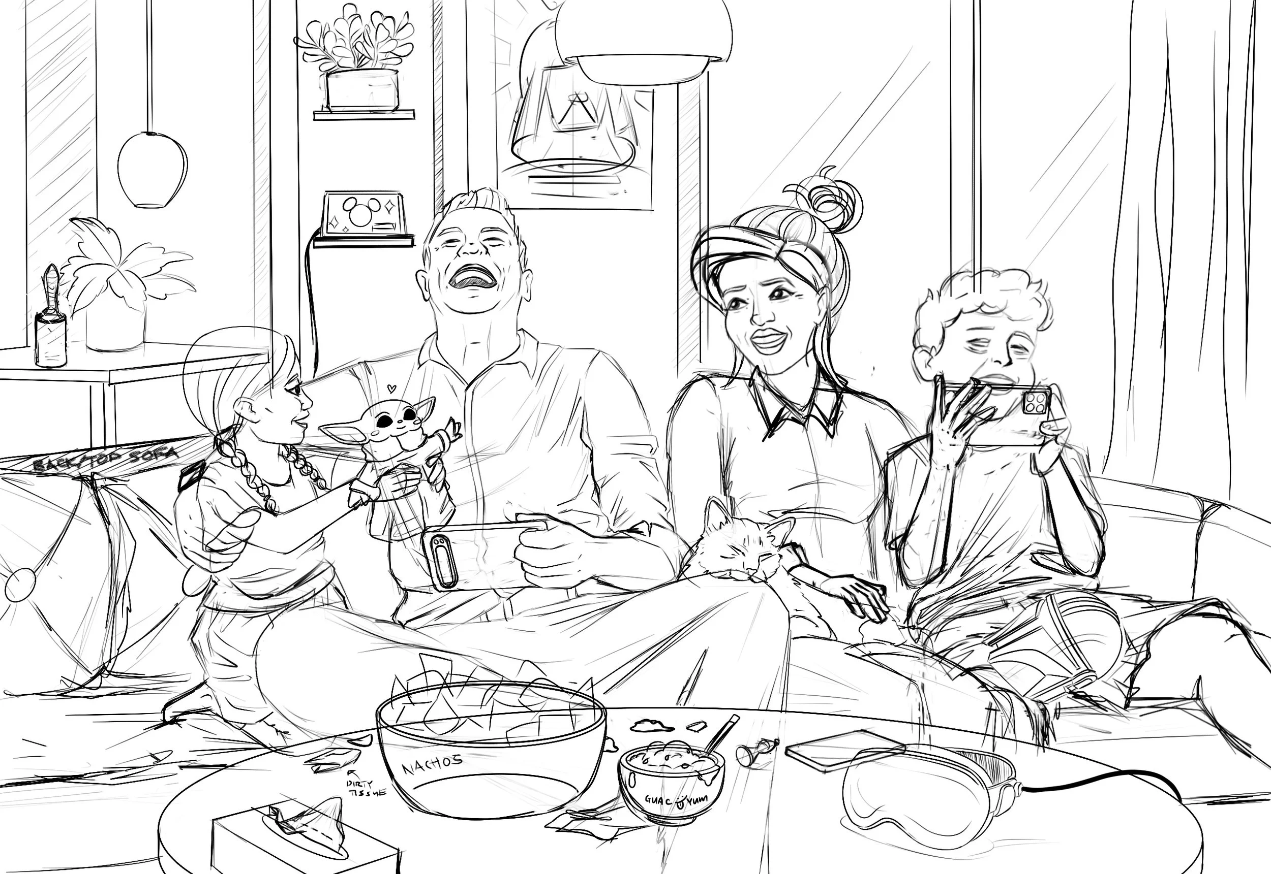
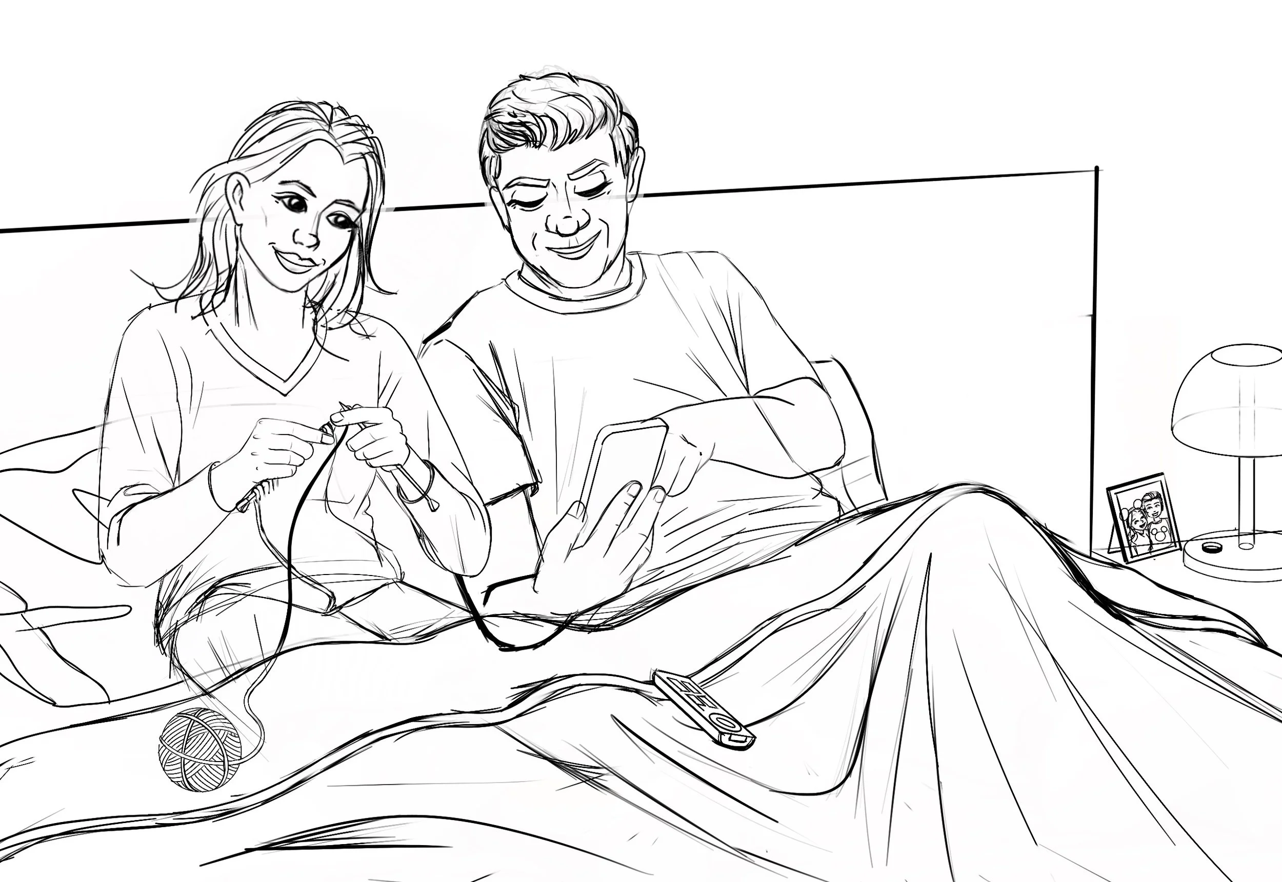
I led the illustration work for a narrative experience that helped shift leadership conversations from features and revenue to empathy, bringing attention back to the people we serve and how Disney can naturally fit into their everyday moments.
Goals
Tell a human, relatable story through illustration
Showcase how Disney integrates into everyday family life
Centre empathy over sales messaging
Support design alignment across UX and leadership
Deliver both digital and print-ready artwork on a tight timeline
Visual Direction
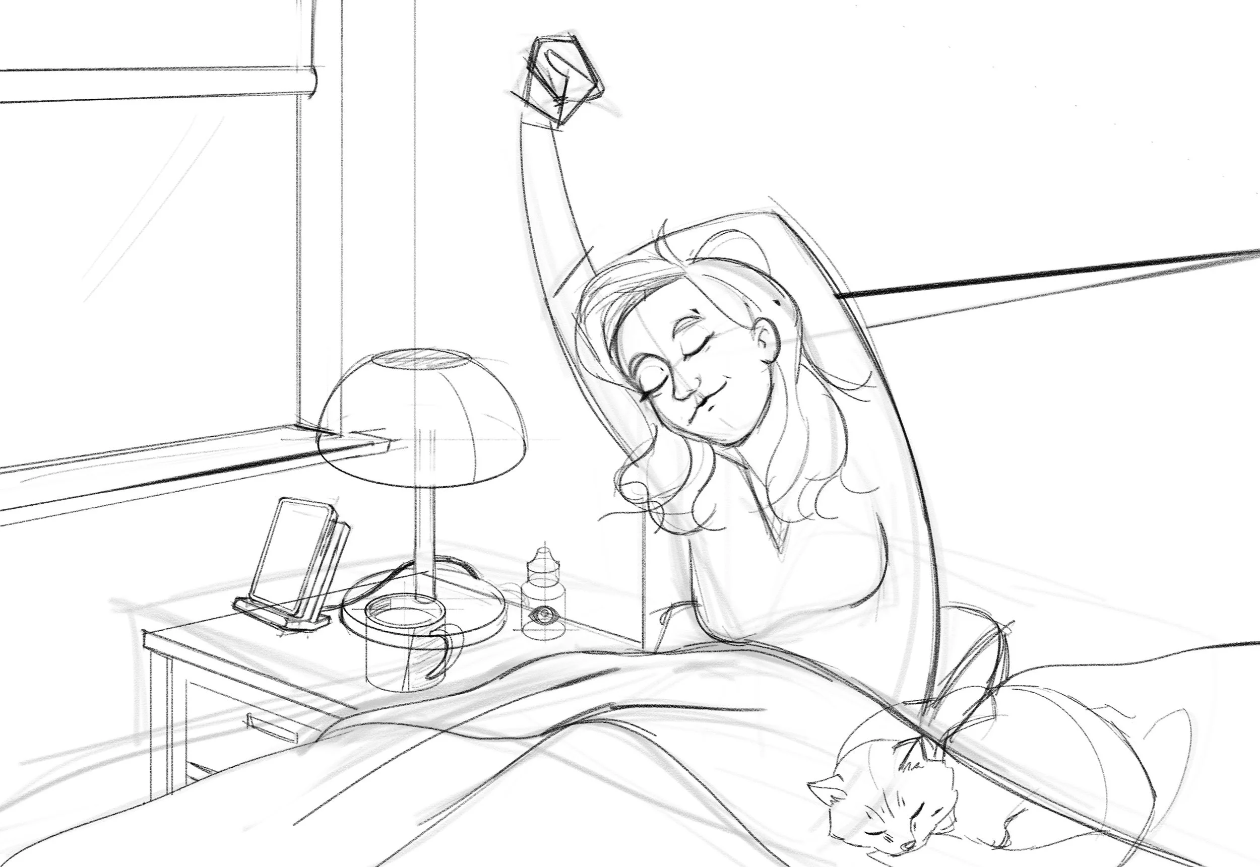
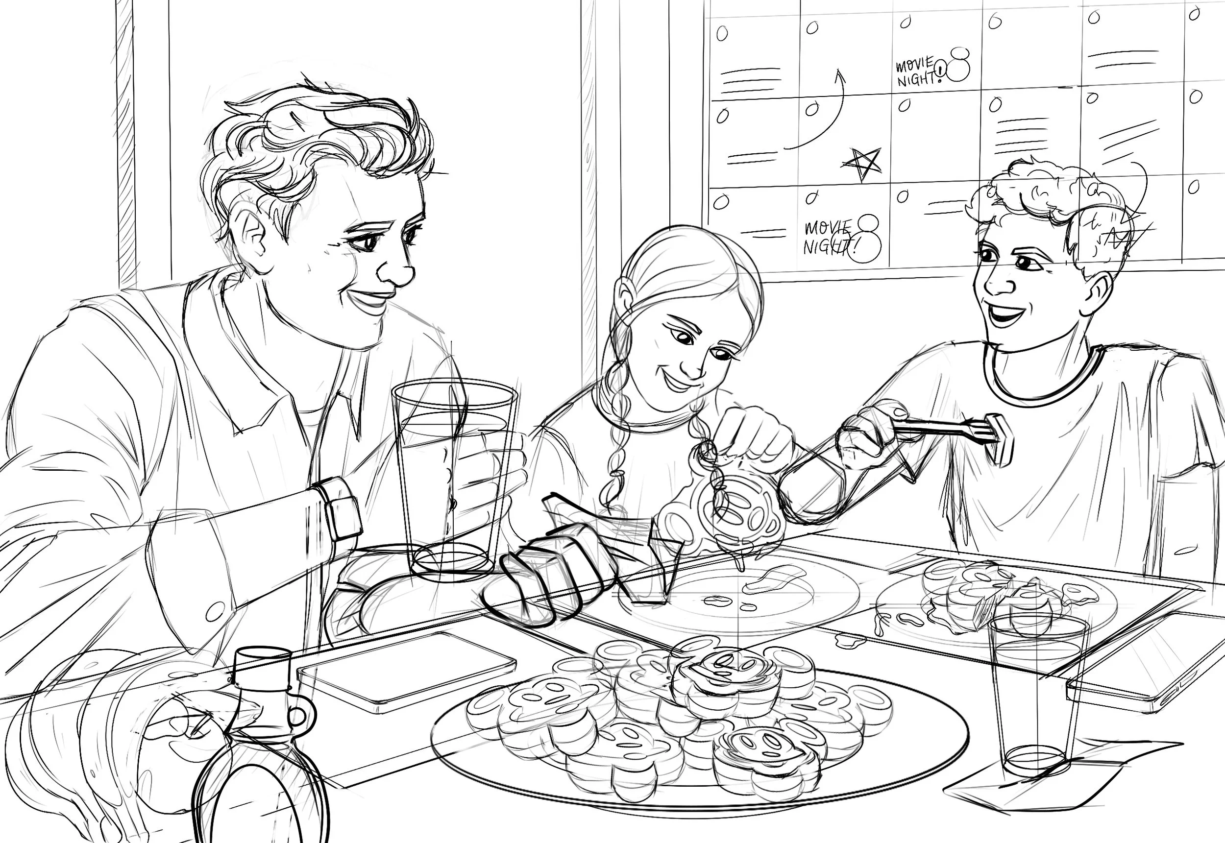
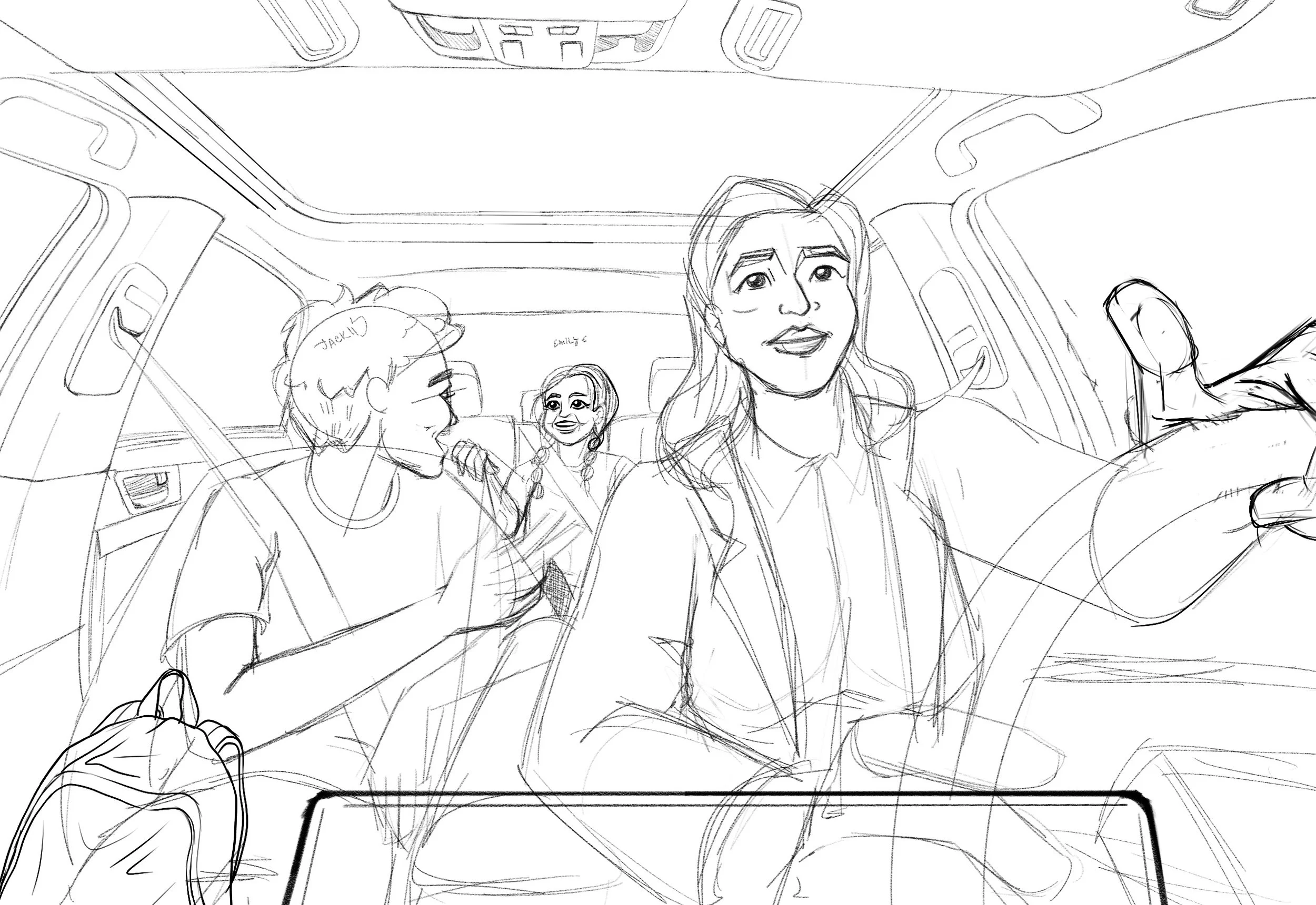
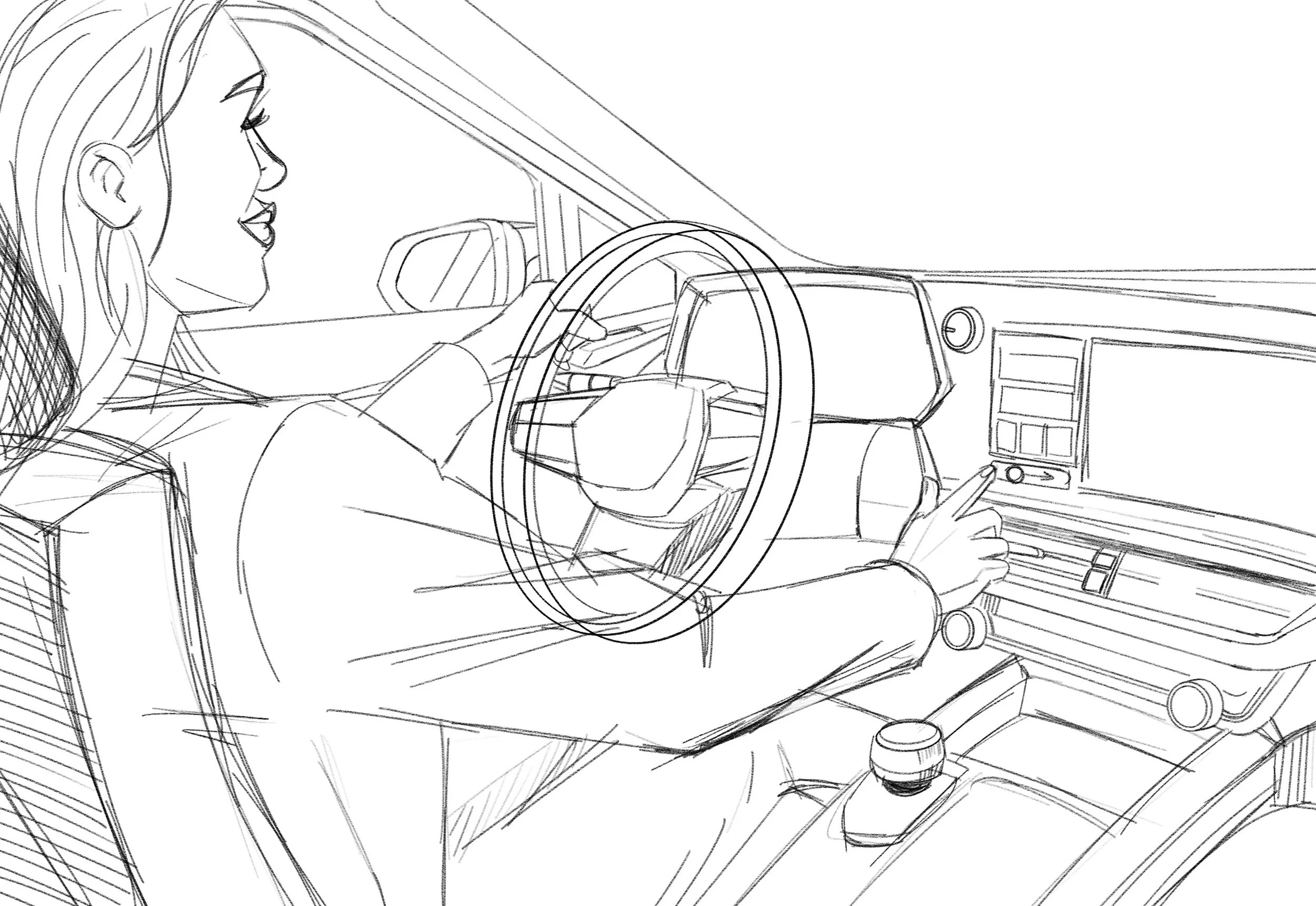
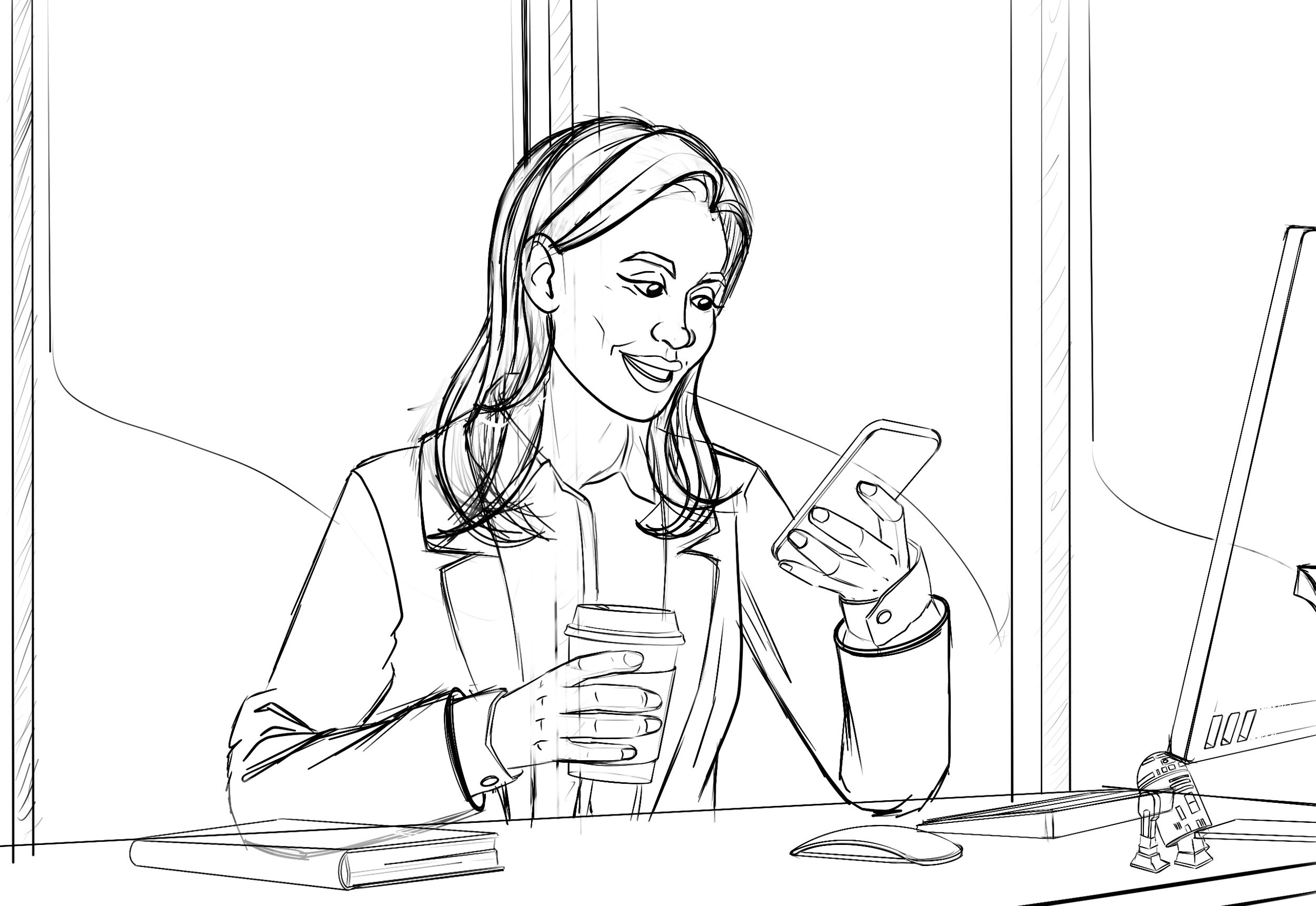
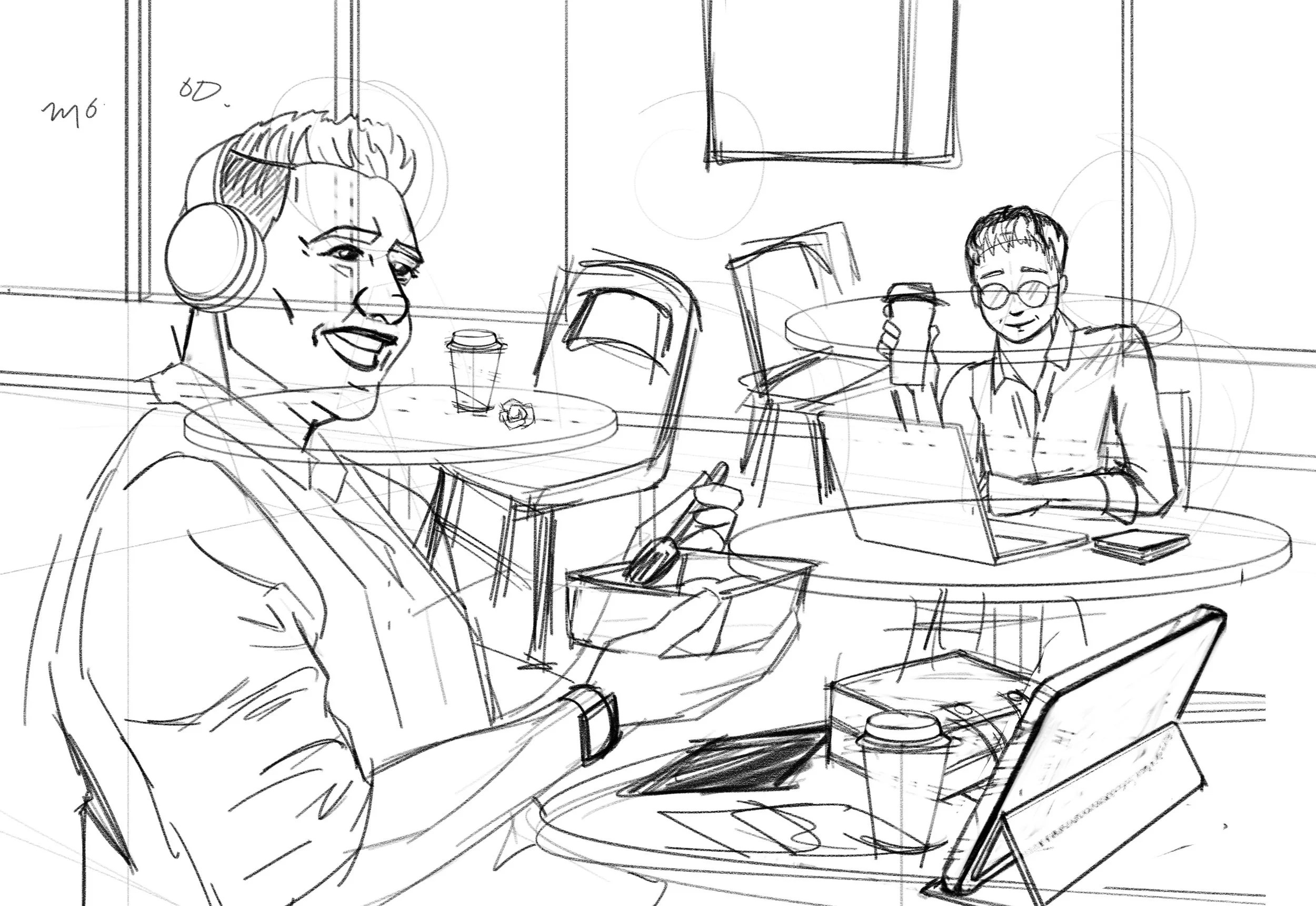
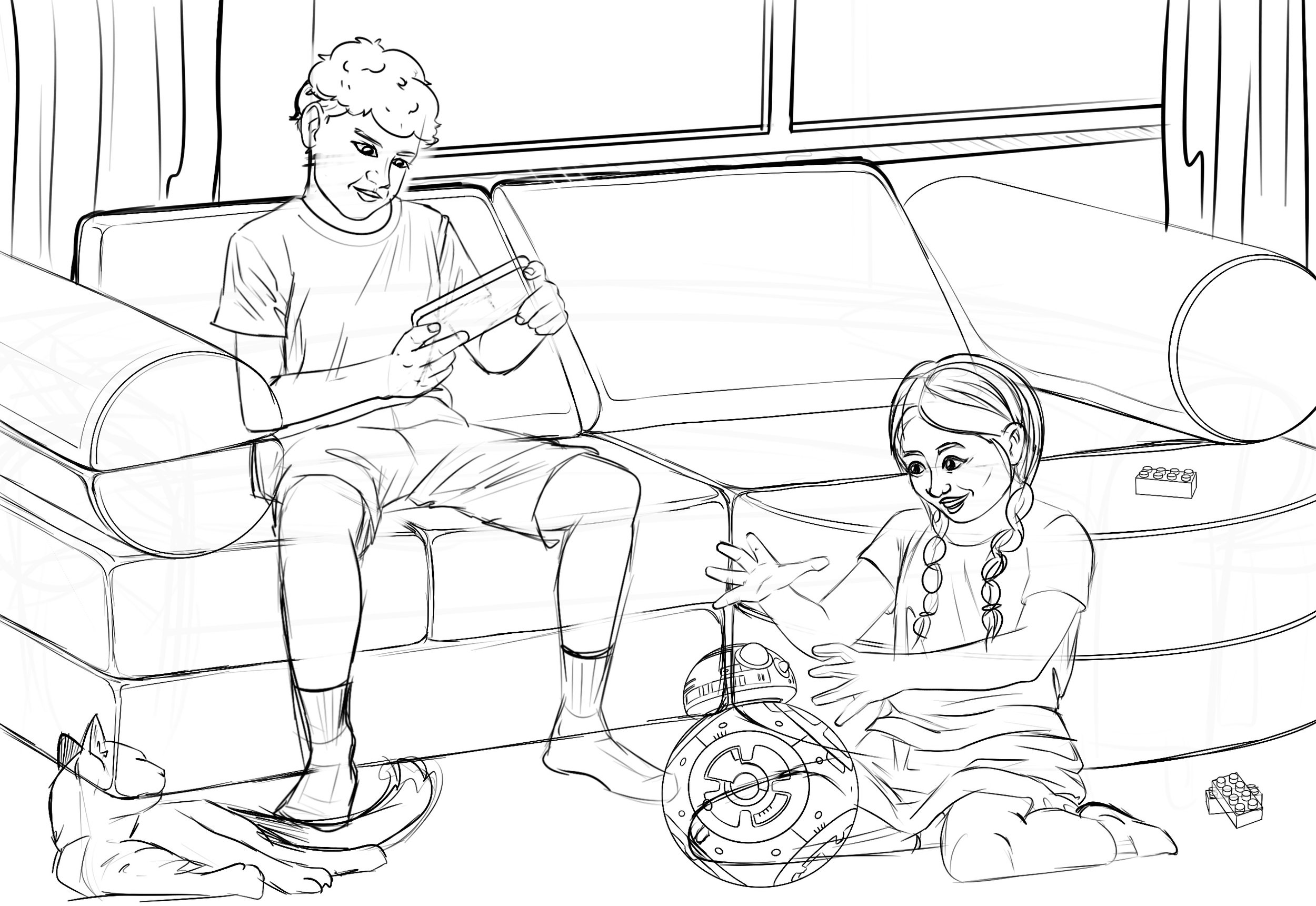
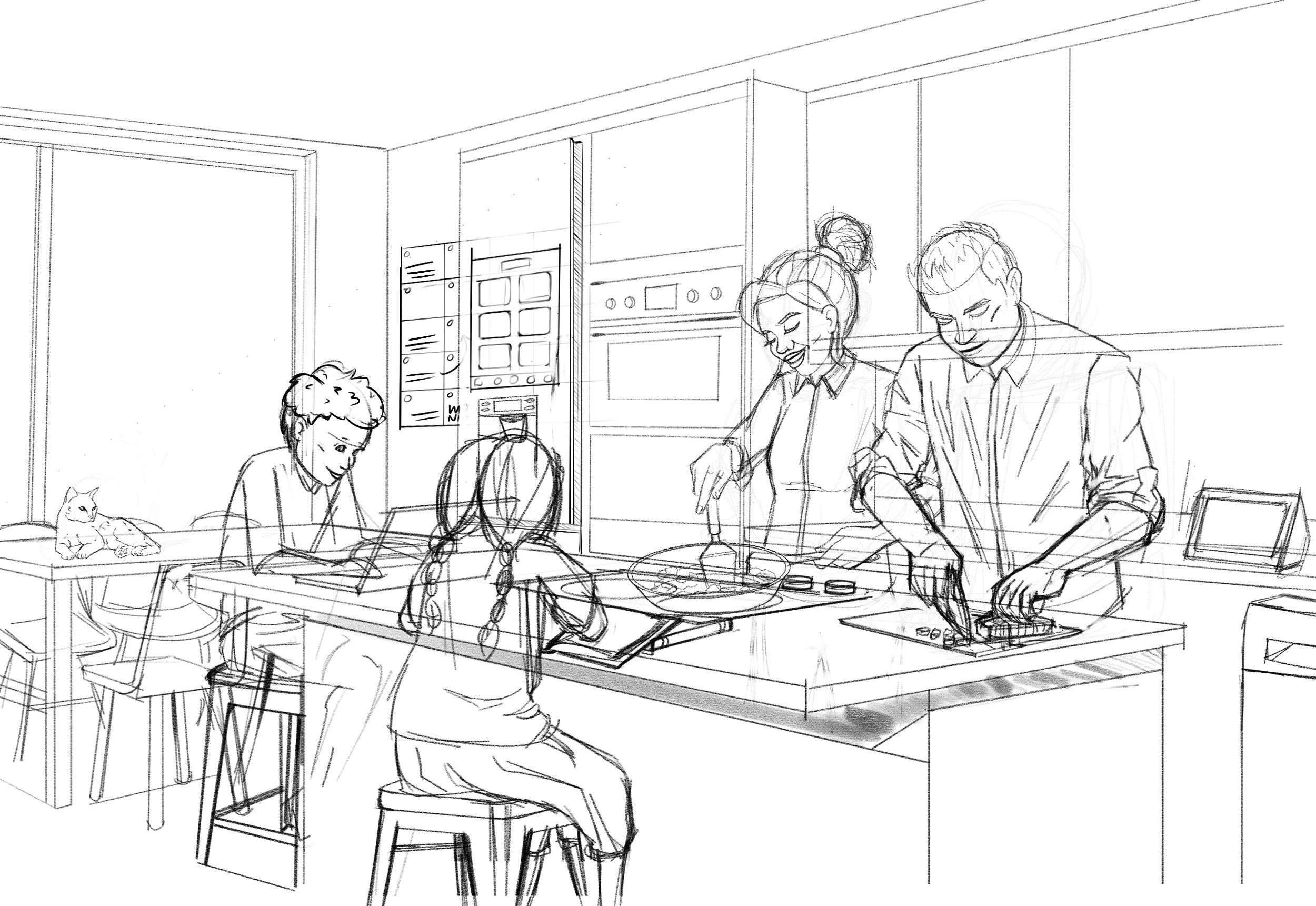
As the lead illustrator, I collaborated closely with design directors to define a style that balanced relatability with simplicity. We landed on a simplified realism approach; detailed enough to tell a clear story, but abstracted enough to feel universal.
Using colour and composition as storytelling tools:
A warm palette for home life and private settings.
A cool palette for away-from-home moments like work and commutes.
Scene framing that placed the viewer within the environment, making them feel like part of the family’s daily rhythm.
Compositions focusing on the human experience.
Process
I sketched concepts and storyboards from a provided script, then directed a supporting illustrator on vector linework before completing the final illustrations in Adobe Illustrator.
Final Output
I collaborated with Strategic Operations to bring the artwork to life as framed prints for on-site presentation and partnered with UX Engineering to transform the illustrations for an interactive mobile experience where users could explore the story and share their own Disney moments.
The entire project—from onboarding to final print delivery—was completed in under two months through strong cross-functional collaboration.


Impact
The intention was to reflect, not idealize, everyday life. Food left stains. Toys were on the floor. The magic of Disney appeared not as a product placement, but as a backdrop to meaningful family connection.
These illustrations:
Helped refocus executive conversations on empathy and user lifestyle, rather than features or revenue.
Sparked cross-functional discussions about embedding storytelling into UX strategy.
Supported a mindset shift from transactional touchpoints to human-centered moments of magic.